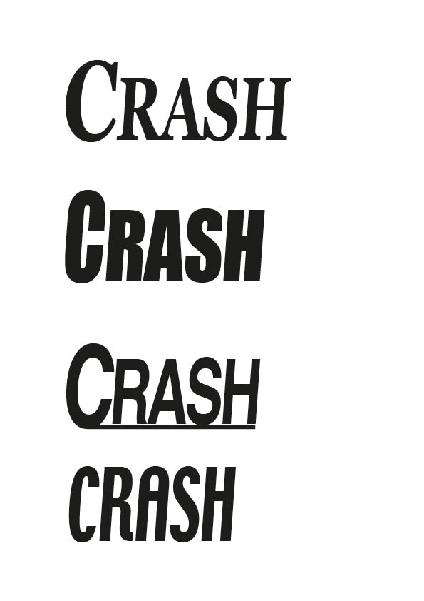
I have chosen the 3rd logo down because I think it is the easiest one to read and will be clear to see from a distance and is also aesthetically pleasing. The top one is clear and looks nice but would not be appropriate for the genre of magazine that I have chosen as it is quite old fashioned and fancy, it may fit better for a classical or old school rock magazine. The second one down is bold but the font is not too easy to read from afar and it perhapps a bit plain and boring and the last one looks more like it should be for a gaming or wildlife magazine than a music magazine because of the shape of the letters, they are a bit too swirly for a rock/metal magazine.