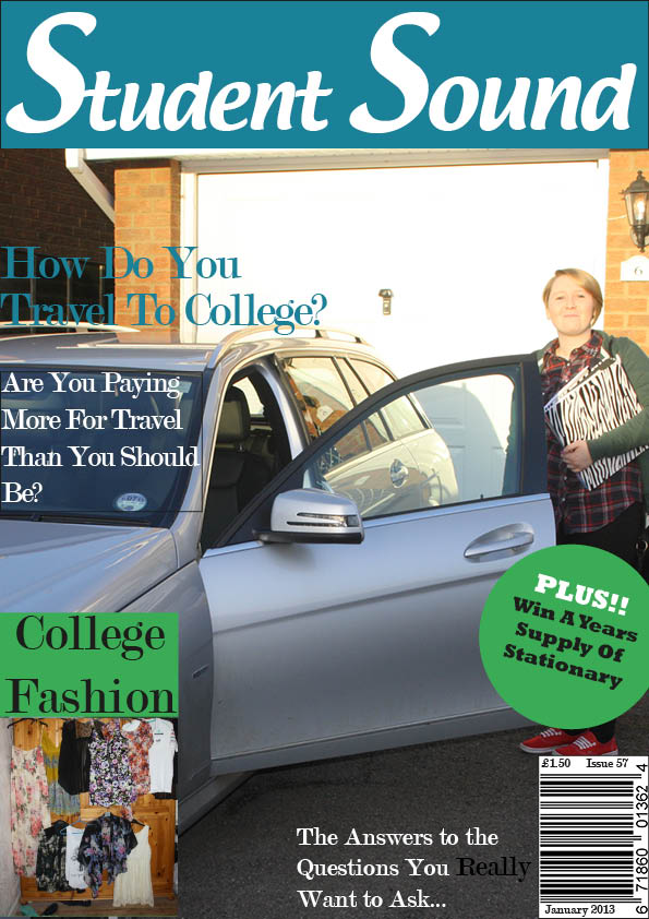
My magazine is aimed at college students between the ages of 16 and 20 and I think my magazine cover appeals to them because it is bright and colourful and the large font for the title is very eye catching. The font is reversed out and the white writing stands out and looks more friendly and happy that black writing would. For my central image I have used a large picture of a happy looking student getting into a nice looking car and this is appealing to students because they obviously want to be happy and they aspire to be able to drive an expensive car. This picture is related to the main cover line and this is clear because the cover line is in a large font and is placed right on top of the image.
To improve the front cover I could have used a brighter colour for the main cover line because it does not stand out enough and is a little hard to read against the different colours of the central image. Also I have left a thin black border around part of the main cover line and this means it doesn’t look very professional.
The colour scheme I have chosen is appealing to everyone because it is bright but is gender neutral and so shows that the magazine is for everyone. My puff is bright and eye catching but I could have made it bigger and brighter to make it even more eye catching and to make it seem more exciting.
I have used a direct mode of address for my magazine and this makes the audience feel like the magazine is aimed at them personally and so will be more likely to buy and read it.
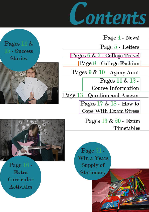
My contents page follows the colour scheme from the front cover but the title is on a black background and this is so that it looks more formal however it does make the page less bright and so I should have used a different colour, such as green. The layout of my contents page is clear and would be easy for students to read and use, my target audience would be less likely to read a magazine if it is too busy and they cannot easily find the articles and features they want to look at. I have used 3 pictures and a puff with each of the pictures to highlight the main stories in this magazine and to hopefully appeal to the audience.
Overall I think my contents page is a bit plain and there are a few empty white spaces and to improve it I could have used more pictures and more colour but it is neat and clear therefore will appeal to the target audience of teenagers.
I have learnt how to use InDesign and how to create a magazine front cover and contents page that is appealing and has a clear layout. I have also learnt that sometimes less is more and sticking to a simple colour scheme makes the magazine look a lot more professional. Only using a few different colours and a few different fonts makes the magazine much more appealing, too many colours and fonts look busy, cheap and messy.